10.12.12

Seasons Greetings


Fancy a nice Scotch and game of chess or maybe reading one of my many leather-bound books and my apartment smells of rich mahogany!

25.10.12

Video Nasty Poster prints now in!

So the prints have arrived from the printers and the poster collective are sending out the first batch.


Theres still a some left if you want to grab my only limited edition print:

  • Money from each sale goes to support Keep A Breast breast cancer charity 
  • Hand Numbered Edition of 150 (will never be printed again), 
  • Fine art Giclée printed on thick 430gsm textured paper 18″ x 24″
Shop and interview about the inspiration here:  POSTER COLLECTIVE

Heres some detailed shots of the actual print:


17.10.12

Video Nasty Limited Edition Poster Print with Poster Collective


Fancy something a little bit special to celebrate Halloween, Horror and the wonderful world of the Video Nasty... well now you can.

I have come together with the wonderful guy and gals at Poster Collective to produce my first ever limited exclusive limited edition Poster Print

Hand Numbered Edition of 150 (will never be printed again)
Fine art Giclée printed on thick 430gsm textured paper 18″ x 24″
with some money going to the Keep A Breast breast cancer charity!

They will go live on sale 19th
10am EST / 3pm BST / 2pm GMT

So get your mits/claws on it while you can

All details at POSTER COLLECTIVE plus an interview talking about Videos, horror and the inspiration behind the piece.

12.10.12

The Designer Film title treatment

 Im pleased to announce i have worked with one of my favorite indie directors Graham Reznick (I Can See you, The Viewer) and the awesome Glass Eye Pix again on the title treatment for his new film 'The Designer'

3.10.12

Coming Soon...


Save you pennies, cents, euros for October, there could be something cool coming to spend you hard earned money on this festive season...

29.9.12

Almost Human Poster


Heres the Poster artwork for Almost Human. for this one i actually worked up an alternate design which follows along the same lines but with a more minimal vibe, which you can see bellow.


Mark Fisher (guy with the beard) disappeared from his home in a brilliant flash of blue light almost two years ago. His friend Seth Hampton was the last to see him alive. Now a string of grisly, violent murders leads Seth to believe that Mark is back, and something evil is inside of him.


Upon watching the preview i instantly picked up on visual vibes from such films like, Altered States, The Invasion of the Body Snatchers (80s) and obviously The Thing (Carpenter was a big inspiration for the guys), These where all mainly down to this scream that mark does, it was such a powerful image that i really wanted to lead with it and show this distorted scream, the other strong image i got from the film was of Mark getting hit by the blue beam light in the intro sequence so they provided me with the main visual hook for the poster art, with inspiration from posters like The Beast within, The Thing, Madman, Friday the 13th part 3 (my personal favourite of the series!!) even berserker, Prince of Darkness and the altered states poster itself. My other big inspiration was a John Saul book i picked up called Comes the blind fury which had a great image of a blind girl lit from the bellow.


Joe Begos the director wanted a montage design so i wanted to interpret it in a different way this time, leading with the main scream and fitting the imagery inside of that. For the montage was all about setting the seen so i wanted to convey this sense of fear and loss of control in the characters, so there aren't any 'guns out' building a sense of fear. then i wanted to show some of the action but not give away too much, so keeping an air of mystery to draw the viewer in.


The only controversial image was the naked sort of slim covered girl, as it was such a contrasting image against the rest i felt it really held power, plus being a woman it broke up the rest of the images and added air of mystery, 'who is she?' 'what is going on there', which then leads down to the pods on the bottom right and we start to get more of a twist for people to interpret !


Finally the title treatment was a big thing for the designs vibe, i wanted to keep it more conservative with a alien vibe. I experimented with different letter forms to convey this. and created a logo which is sort of modern but actually is a very classic 70s inspired. to contrast with the rest of the imagery and layout.


As i mentioned at the start i did work up an alternative design, it was always in my head to go down a more minimal route with the main character, so it want much more work to see how that design would play out (the joys of working digitally!). I also think it might be more fitting for the DVD market in foreign territories where they seem to go for a more minimal image, so it offers options to the distributors and will be interesting to see if they run with it. See what you think below


18.9.12

Hypothermia Poster


Here's another Glass Eye Pix / Dark Sky Pictures MPI Media the guys behind The Innkeepers.


Ill need to cast my mind back a bit as this one goes back a bit, I actually completed the design way back in October of last year. MPI Media contacted me about this one wanting a classic creature feature design.  


The basic premise is a family out ice fishing catch more than they bargained for (that's not the official line but  hey i can't resist a good pun!) When they stumble across a monster from the deep!  Well I'm a massive fan of snow bound horrors and monster horror films (which sadly dont get made as much)  so i had a field playing around with these themes.


As the action centres around this monster coming out of the ice hole it gave me this great visual of the plain white snow then this this dark mysterious hole OF TERROR!!


So i emphasised the hole more to represent said terror with its sinister cracks splitting and breaking along the clean crisp ice (i was quite proud of my cracks, i spent quite a bit of time on the detailing), which reach out to the viewer as well as the family in the distance. It also allowed me to play with the use of the negative space in the poster, i loved the idea of the image starting off really dark at the top the trailers lights just highlighting the characters in the distance then this gradually bleeds out into the white nothingness of the paper at the bottom with just the cracks intersecting the two. then keeping the title treatment in perspective to lead the eye down.


There where actually two title treatments i offered up, this blood version and one made up of  the cracks continued on from the hole. The blood one won out for impact of the read.There where also some montage concepts thrown into the mix, particularly as Michael Rooker is staring in it but it just wasn't fitting with the genre, so i talked the guys into making more of a picture treatment out of the design rather than loose the atmosphere and impact.


The design sort of recreates a scene in the move but taken from an alternate angle, the family isolated on the lake and trapped in a trailer looking out into the night to keep watch for where ever is out there beyond the darkness under the frozen ice.....


13.9.12

Monster Fest 2012 poster


Here is the artwork i created for Monster Pictures Australian horror film festival Monster Fest.

The concept was to create a classic film poster design based on the monster geisha character they have made for this promo short created by Isabel Peppard as the face of the fest for 2012 (it's a metamorphosis of there previous asian film festival geisha character).


Its a straight down the line celebration of classic exploitation, monster, horror design to really drive home that film style vibe for the folks and as a fun poster momentum of the festival.


 As the main visual was to be of a strong female character my instant inspiration was the wonderful work of Frank Frazetta (again!) you just cant get sexier female illustrations for my money! so that really was the tone i wanted to capture, the powerful sexy and voluptuous fantasy barbarian monster woman walking through the mountains of blood guts and bones!!


I did slightly sex up the outfit a touch to a more thong inspired garment so emphasizing the ladies powerful posterior more as well as bosom to capture the classic spirit of the piece.  


31.7.12

John Carpenter's They Live


Due to the write up being sooo long on this one im attaching a more condensed version bellow, then read on for the more waxing lyrical original, let me know which you prefer for the forthcoming site:

"i went out to illustrate piper as a modern religious saint character rising up against the adversity, the police and authorities are crushing the homeless corrupting and spirituality (church). then above the ghettos are the towering office blocks of corporate industry dominating the skyline and looming over you with there consumerism messages and the rich aliens are enclosing in the blue collar workers make there last stand. all wrapped up in a sudo religious iconography meets sci-fi, action, social commentary epic interpretation, in a sort of its post modern delivery but all done with pure love, i listened to the soundtrack continuously whilst working on it!!!"

Well heres my artwork for They Live, As you may (or may not) know I'm a massive John Carpenter Fan also a huge Rowdy Roddy 'Hot Rod' Piper Fan from my wrestling days (they should have made Tag Team a series!!!). i absolutely love They Live, So you can rest assured that this title has been treated with absolute care, attention and devotion which it rightly deserves !! (so that's the gushing over as the nun said to the vicar!). i was pretty excited to get get unleashed on this juggernaut of social commentary meets sci-fi action...

I wanted to create something in a true 80s keyart style, that was VERY action packed, putting piper in an Italian poster style, testosterone driven almost god like religious icon standing aloft like a beacon of social commentary surrounded by the imposing odds of alien control, and NOT forgetting Keith David (who sadly gets pretty much left off all the promotional material for they live, the mans survives The Thing! hes A LEGEND in his own right They Live, The Thing, Road House, platoon COME ON!)

So the challenge lay in trying to compact all that in a design and integrate a story story-line narrative and not have it as just a mass pile of stuff!

This design was actually the merging of two concepts. on had a lone piper in Bank mode and the other had this pair which was inspired by the final shootout sequence.


For pipers image I wanted this rippling muscle god with the awesome blond streaked mullet flowing man (he is massive in the film, the guy was a wrestler and that's where most of his fan base comes from, so i needed to represent the 80s WWF crew). so i thought to hell with it and just rip the god damn the shirt sleeves off, i know it doesn't happen in the film but THAT'S the point, pick up a copy of any Bronx Warriors on VHS and you will know where I'm coming from. Visually this is all steeped in 70s/80s Italian poster/video art history and people like Enzo Sciotti (its so ingrained in my brain now that its almost instinct). He has a total shooting from the pelvis stance of resistance as he's striding adversity. Like i said i did want to give this piece a saintly religious iconography vibe... which is something that MUST have been an influence on the Italian works too, with there culture so steeped in the church, that's my theory anyway!. I didn't want to cover his eyes as i felt it removed the emotion, so Keith was given the cool shades to convey that and piper has his in the pocket.


 Colour was the big thing which allowed me to separate out the elements to prevent it all getting too busy. as the alien world is seen in monochrome throughout the film i wanted to keep true to that but stylise it slightly with a more blueish hue. when it came to the Aliens i wanted to convey a sense of claustrophobia so all the buildings and aliens are leaning inwards like waves about to crash in and drown the main characters.


For the bottom section i wanted some action sequence which would depict to depict the other side of the world and have the police alien lines (which is how they are seen to the average Joe), the eviction scene with the church (subliminal religious/saint imagery again) is such a pivotal element that i had to get it in. Also whenever you see the police they always bathed in a red flare light so that was a great counter balance to the blue of the top!


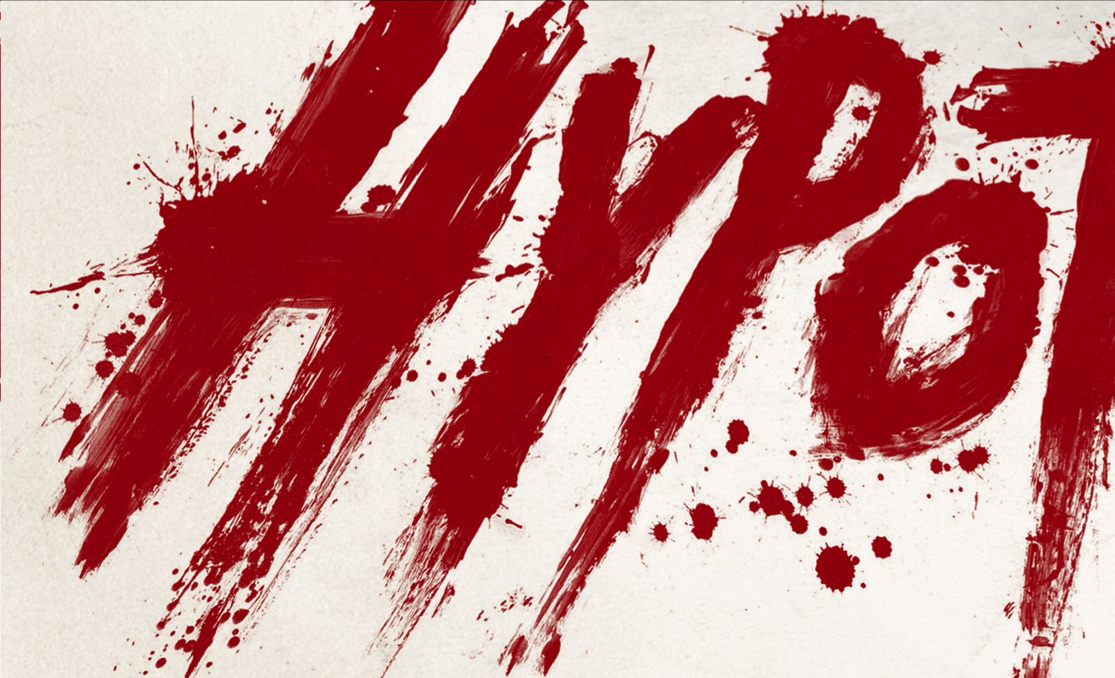
The guys at Scream Factory wanted me to use the original title treatment. Then I had to use Albertus font for all the other copy of course, being a classic Carpenter film. I am hoping to do a limited edition print run of this (when the websites up) and will be shifting the text elements around to make it more theatrical poster esque, so i will also have to change the title treatment which im toying with the idea of putting it in Italian 'Essi vivono'... watch this space!!!


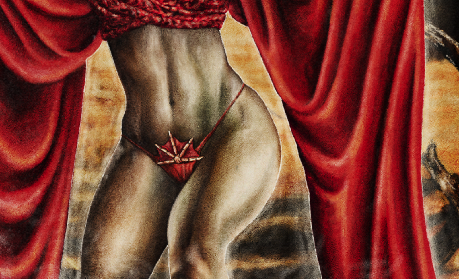
As always right click on the close up sections to get a detailed view.

19.7.12

BATTLEGROUND poster


This is for a small budget horror/suspence flick with tones of those old 80's Nam style revenge War films, gone bad!

Basically its about a group of robbers who get mixed up in the forest with an old Vietnam vet that lives out there as a hermit surrounded by an arsenal of weapons and a Cong style den!,
i thought the teaser trailers where interesting TEASER and CONCEPT (the film was originally titled Skeleton Lake... if there's any confusion) Andi felt it was a great opportunity to pay tribute to those Nam action films of the 80's which i used to love as a kid. Although it needed to be kept on a more serious level to Hobo so i couldn't have any over the top layouts, although I did have some great set photos to play around with for this one and listened to the Rambo soundtrack to get me in the Zone!

As with all these old Nam posters/video covers the main character was central to the design usually toting an over sized gun.
So i chose to take that stereo type and give a more sombre that twist of the aging Rambo who's gone even further over the edge, and the poster did become a some what alternative comment on The Rambo posters as i developed the design. The characters pose is very expressive i chose his arsenal as a specific homage to those 80's Vet film so we have the Uzi 9mm (i did also want to go with a machete but it was felt that it would make it out to be more horror orientated than action, which with hindsight after viewing the film myself! would have been the right tone... because that's what it is!!!) in one had and most importantly the iconic Rambo M16 (complete with bullet belt) in the other. However the way the character is holding them shows a more weathered, tired and darker attitude. In the trailers i was never too sure how he was coming across hero or villain? (especially in the earlier concept trailer) so i wanted to keep that ambiguity to him, although he is kited out we see he's looking downwards to the smoking gun in his hand with these almost totally blacked out eye sockets (which was kind of inspired by the work of Tim Bradstreet). So you really cant place him.

I surrounded the larger character of the vet with the more explanatory narrative elements about the film, so of course the big ol' explosion! On one side and the dead bank robber with the guns and cash which sets off the whole story draped along the bottom. Then main gang is seen weaving there way around the edge hunting him through the grass yet there is a tone of who's hunting who as they seem edgy in there stances. Finally to round off the layout and give it that almost mushroom cloud formation, a large red skull which again helps give the poster that darker tone and was inspired by the scene in the concept trailer where he boils a skull, I'm not sure if this was carried through to the final film but it still works in the posters concept and is a sweet device with which i could show the vets background in Nam and have those iconic scenes of the patrol walking through the paddy fields as well as the hughes flying through the sky (got to get those helicopters in!!)

The title itself i wanted to keep quite simple and bold to contrast against the busy ness of the illustration.

So there it is a homage to those 80's Nam films but with a more darker and sombre twist.

16.7.12

The House of the Devil Record cover

Here is the artwork for Death waltz Recordings (which i also created the logo for!) Limited edition Vinyl record release of Ti West's House of The Devil by Jeff Grace. I was stoked about working on this as i'm a massive fan of Jeff Graces scores, hes stuff is true classic soundtrack material, with touches of Wendy Carlos to Jerry Goldsmith. seriously check out his work... as well as house of the Devil hes done fantastic scores for I can see you, The Last Winter, Trigger Man, more recently The Innkeepers, Stake Land and Meeks Cutoff.
 

The Brief from Death Waltz was just for alternate artwork which freed me up to not have the constraints of including certain characters and plot line elements so i was free to explore a more conceptual design. I wanted to be more emotive of Jeff Music style for people as it really is a brilliant classic horror music score i instantly wanted to and go down that classic VHS fantasy artwork road with it. (Im hoping one day VHS artwork will be viewed as a legitimate art style in its own right !!).


Note the totally inaccurate house for that authentic touch!! also another interesting side note being that it was actually Ti West's idea to incorporate in a Pentagram in after viewing my design concepts, i looked at several ways to work one into the design but the house being the main focus of the evil i thought it was the best place for the narrative.


In true VHS style the designs is quite a quick visual hit so the viewer gets an instant recognition  of the story in a few seconds of shelf viewing.


8.7.12

A Cadaver Christmas


Just released today via killerfilm.com is the artwork i did for a back comedy grindhouse zombie horror festive flick called A Cadaver Christmas (you can already buy it on Amazon now!).

this was to be a DVD cover so to match the grainy visual grindhouse film effect i decided to approach the cover like a weathered old video cover (a popular misconception - ahem... dont look back at my previous vhs designs - when weathering a video cover is that all the edges get frayed, because of the video case only the top and bottom would wear over time while the sides would be protected, how anal am i!)


For the design itself i wanted to give it a more humorous twist, i instantly connected the title with that classic cadaver feet/toe tag image so thought it would be a great way to frame the logo in the montage, it then also enabled me to tell the story of the film from top to bottom... so the Cadaver feet and the blanket blend into the snow which leads to the college* where the janitor works and the zombies (cadavers!) scenario plays out.


Although iv'e only shown The 3 main protagonists in the film there are actually 6/7 characters all in all but visually trying to squeeze everyone in would have been an explosion of chaos, (as Jack Burt... sorry! i always say "just because its in the film, doesn't  mean it has to be on the cover) when doing montage designs (which i often get hired to do) i try and put elements in which will tell a story and give visual hooks in the most compact way possible (but not minimal buy a long shot!),


This is a perfect example of what i mean though as the 3 characters we went with had the most visual connection and recognizable, so the main character he Janitor with BLOODY mop, slightly manic twitchy eyed cop and festive alcoholic (he does drink from a hip flask but again the hip flask wasn't instantly recognisable so i gave him the more obvious Whiskey bottle (which he's spilling in HORROR!!! and it looked more funny).

The other characters (while not to detract from them, of the bartender, Campus security girl and pervert perp) didn't have that obvious visual (which i know iv'e mentioned about 500 times now, but bear with me) connection. The guys at Level 33 distribution (who where great to work with very enthusiastic, they pushed out the budget on this one but where not overly protective and open to any suggestions, so 4 star clients!) agreed and we streamlined the characters. 

Although the College* building i have depicted isn't an exact representation of the one from the film (i don't think you actually see it in full) i wanted a classic school/university building, as i felt it was the most integral part of the design which would links all the elements together. Its great when you have a destination for these designs as i feel it helps anchor all the elements (and story line) around a destination. I sort of read a criticism on a site about there initial photoshop design being one of confusion about the characters, zombies Janitor and Christmas so i wanted to avoid that and portray the college, where cadavers reanimate and a janitor with a rag tag bunch of people battle them at Christmas... Simple as that!


For the festive touches we did look at several approaches, i didn't want to make it too cheesy or tacky so i sort of went for a festive twist on the old VHS frame style which just clicked then with the snow etc. it really boosted that Christmas connection.

On a technical side iv'e been experimenting more with airbrushing effect (as i mentioned on my new logo) for the background glows and washes so here with the snow it really worked out well i felt it softens up the edges more, hats off the Enzo Sciotti for the inspiration behind that technique... check out his work he was the Italian Master, forget the renaissance!!

7.7.12

New Dude Designs logo


As im looking to create a new website for the work (along side the blog) to hopefully sell limited edition poster prints and make the work more easily navigational. I thought it was time to spruce of the old handle, so here finally is my ostentatious 70s airbrush inspired design. It was always the direction i had in mine when i created the first sketches.


its just took a while to get here as ive been developing my photoshop painting techniques and recently experimenting with airbrushing  more on the posters for background washes and highlights i felt i could tackle the logo effect. so its about 130 layers and masking off sections then doing quick airbrush esque gradient colours (3 all in all not including the yellow base colour for the main text).

Im sure it will jar with some peoples taste but i want a trully 70s esque almost gordy gold stlye wich you dont see around much these day and step away from the more rough grunge style of the last incarnation.

6.6.12

Frankenstein Created Bikers


Just when you thought it was safe to jump back on the hog... comes Frankenstein Created Bikers sequel to Dear God No!


There was a load of creative Freedom on this one James Bickert (the director) does let me run wild with no expectation (except for insisting breasts enter the picture some where!), also as the movie is yet to be filmed i didn't really have any cast restrictions. i skyped with the director and chatted about the plot lines  characters and twists going into this one so all the elements do relate to certain elements of the film. Like the doctor, Jett again, and the woman who like to blow up police cars with dynamite!! 


After the first one (Dear God No!) i just wanted (and needed) to create the most outrageous exploitation biker image imaginable... I knew the sexy dynamite lady had to be central and i thought what could be a more OTT, cheesy, sexy with a 70s vibe than some outlaw bikers riding forth from out from between a girls fishnet suspendered thighs... Also it was a twist on creaition and brth of the bikers, seriously i'm sure a counselor would have a field day with this image!! (theres lots of issues going on here!!).


For the Bikers James mentioned having slightly zombie bikers but i wasn't sure to which degree these bikers would be zombiefied and its also very hard to get that across with all the hair and sunglasses so i chose to visualize it more through the bikes with the skull headlamp and wing mirrors then little touches like the Hell Bound foot pegs.

To get that classic explotion effect in this one i integrated i painted the background canvas with acrylics and the scanned that it to work digitally over the top, so it was a cool blending of physical and digital mediums on this design

Finally you could say i really put myself into this piece....