30.3.12

What Culture Interview by Neil Innes

Last year i read a great peice by Neil Innes on: 'The lost Art of the Film Poster'
So it was great to sit down and chat about The Dude Designs work with him for WhatCulture: 'The Art of Film Art'

26.3.12

Would You Rather Poster 1


Here is one of two poster designs i did for Would You Rather staring Brittany Snow, Jeffery Combs, Sasha Grey, 'Desperate to help her ailing brother, a young woman agrees to compete in a deadly game of "Would You Rather," hosted by an sadistic aristocrats 'Lambrick Foundation'.

I wanted to do something a bit more off the wall for this one (as the 2nd design i did has a more classic poster style) so i could try an be a bit more out there for this design.

When i initially spoke with David Guy Levy (the director) he liked to think of it as 'Funny Games' meets 'Clue' which pretty much set on the direction for these designs.

Although the plot mainly revolves around Brittany Snow, there are 9 guests at the table with some really recognisable faces amongst them Sasha Grey (lots of 'ahem' HOT movies) , John Heard (C.H.U.D), Eddie Steeples (My name is Earl) and Robb Wells ('Trailer Park Boys' who is the first actor I've got to illustrate up twice hobo being the other one (he's the dude in the man hole cover) and many others... so trying to fit all the guests in plus focusing on Coombs and Snow was just going to get messy so i used the old 70s disaster star fest technique of having the actors or 'guests' layed out in boxes.

To create a different sort of design i looked at a lot of the old polish posters and Swiss 'Plakatstil' stlye designs of the 60s, i also wanted to take a swing at the modern 'new wave' minimal icon poster designs. I really wanted to create a visual which had this totally alternative aesthetic if it was a clean edged poster i don't this it would reflect the dark nature of the movie so i wanted to give it that old screen printed style with the colours out of registration to reflect that... clean and minimal but twisted to giving it a more sinister and unnerving edge!


There is a scene in the film where all the guests sit down at the dinner table for the first time and in the rough cut they had temporarily laid in a Wendy Carlos' track of 'Funeral of Queen Mary,' and her music has such a powerful unnerving bizarrely trippy quality that I wanted something which looked like that felt, even down to the title placement. I wanted it all to follow that sort of big twisted beat 'BAM' 'BAM' drum beat with the heavy WOULD YOU at the top and RATHER at the bottom, i sort of felt what the director was trying to pick up on and reflect the atmosphere of this 'Lambrick Foundation' and the unnerving tone of the film as the game of 'Would You Rather' unravels over dinner."

As David Harley wrote in the Bloody Disgusting story 'Queen Mary' has since been replaced with a new track by Daniel Hunt (Ladytron) and Bardi Johannsson (Bang Gang).

Well hope you dig the different vibe on this one, you can view the trailer on BD as well...

9.3.12

Cell Count Movie Poster


For Cell Count I wanted to crate a modern illustrated montage poster. A lot times of this type of work can get labelled as 'retro' but i really wanted to show that this type of art is still as fresh, fun and relevant for today's movie market in 2012 as it was back in 1972.

Cell Count is also the type of movie which can benefits from this school of poster art as there s some much going on, so while you could just depict one isolated character or image to promote the film, it wouldn't really tell you the whole story! and my main aim for the design was to capture all the rich nuances, characters, plot twists and atmosphere of the movie to build this static trailer.

I took a lot of influence from the Thai posters of the 70s, as they always had such a great flair for balancing out a broad spectrum of elements but still tying them together in a composition that looks unified as a whole.

24.2.12

8 Questions with the Dude Designs

A brief chat with the poster collective about design and i select my rundown of (what i feel) are some of the best posters ever... HERE

15.2.12

A Little Bit Zombie Poster


Here the poster art for A little bit zombie, its the first time I've got to really swing my design bat at a full on comedy movie poster!

During a weekend cabin trip to sort out wedding plans, Steve becomes infected by the zombie virus and Tries to battle his overwhelming desire for brains!

The basic challenge was to get 6 characters into a montage and give the piece a narrative whilst trying to make the design visually funny... and humour is an incredibly difficult thing to convey in a single static image (with a touch of horror!). To make the poster visually entertaining, i thought the best route was to create something epic and completely OTT for the subject matter, while playing on something that i depict a lot of in this type of work.... over blown machismo!

To create a classic comedy poster in a fantasy art style, so this piece really came to be a love letter to the such great artists who inspired me growing up, like Frank Frazetta (for EVERYTHING), Boris Vallejo (of course his Vacation stuff but soooo much more as well), John Bolton (thanks for the brilliant Army of Darkness!!). As the saying goes... 'standing on the shoulders of giants', ergo One who develops future intellectual pursuits by understanding the research and works created by notable thinkers of the past, (thanks wikipedia!!)

The comedy angle came from twisting that classic image of machismo by depicting the main character as this totally ripped zombie groom in a stereo typical heroic stance holding his ample-busted perma-tanned bride in one hand while thrusting BRAINSSSSS aloft to the gods!! but contrasting those cliches with a expression that screams PANIC I'M A MILD MANNERED HR MANAGER NOT A ZOMBIE !!!


Tina the bride actually is more in control as character of the pushy bride who REALLY has to get married but possibly more for the attention than anything else!

In this classic setting i was also able to bringing out the rest of the characters personalities so we see Sarah (bottom right) as the not amused by the whole situation sister, Craig (bottom left) beer drinking frat boy esque best friend, Penelope (top left) a preppy zombie hunter and Max (top right) bad tempered zombie hunter, I'm a massive Stephen McHattie fan so it was a joy to be able to paint the dude!!! (i loved Pontypool and Casey actually got me a signed copy of the film for working on the poster!!).


The background elements really help set the tone by allow the viewer to build up a subconscious impression of the story without being too busy and allowing the main focus to stay on the characters.


Title wise I've been looking for an excuse to create a cracked stone type design for ages and now was the time to fulfil that dream!


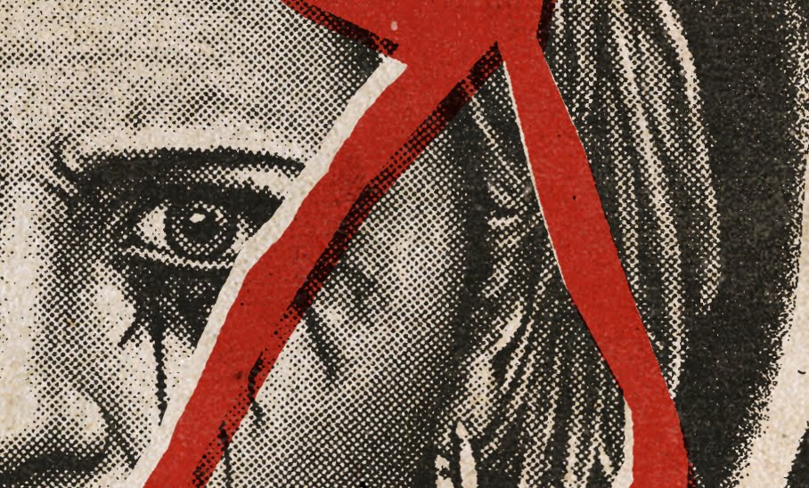
Due to the characters being smaller of this design there was a lot of intricate detailing going on that wont be visible on the web jpg (only the final printed piece), so I'm attaching a couple of closer details shots as well... Enjoy!!!