30.10.19
Coming Soon: Dude Apparel - Kung Fu Collection
Coming soon Dude Apparel - Kung Fu collection… A series of 3 designs which harp back to the glorious days of all things Martial Arts in 70s and 80s, from movies like Drunken Master and Pray for Death, to classic arcade games like Last Ninja and Bad Dudes!
3.9.19
Dude Apparel launch
Dude Apparel is an all-new clothing label from artist Tom Hodge aka The Dude Designs.
www.thedudedesigns.com/dude-apparel
As The Dude Designs, Tom created a cult name as a leading figure in the resurgence of the ‘old school’ poster art aesthetic behind such films as Hobo With a shotgun, Savage Streets, The Innkeepers, They Live, Wolfcop 1&2, The Other side of the door, Joy, Spy and The Heat.
Tom’s passion for retro film art and VHS also combined in his best selling book VHS: Video cover art, which was the first book to take a look at the lost art of the home video boom in the 80s and 90s.
Tom has even stepped behind the Camera to create ‘Teddy Bears Picnic’ his first film outing, which was a proof of concept short, starring Abby Miller (Justified & The Sinner) and Laurence Harvey (Human Centipede 2+3) and has successfully toured around the global film festival circuit.
Through Dude Apparel Tom is now able to bringing his unique visual aesthetic and stylistic approach to the world of clothing. Creating pop culture inspired conceptual collections as a new voice in the world of t-shirt art, apparel, accessories and homeward.
Dude Apparel is now pleased to see the inaugural release of…
Video Store Staff Collection 1.
Ever fantasized about running your own VHS video store in the glorious days of the 80s and 90s? Well, now you can with our new range of stylish video store staff tees, sweatshirts and women’s tank tops. In ‘premium’ double-sided and ‘Standard’ single-sided options.
Based on original 80s video stores for authenticity. Dude apparel has revisited these bastions of the VHS rental boom and reinterpreted them with all new designs to create this collection of high-end fashion apparel for your viewing and wearing pleasure… Which video store will you run?
A few words from Tom Hodge:
“I’m very proud to launch Dude Apparel after a year's planning and organisation, with an inaugural collection that combines a lot of my passions VHS, Vintage and 80s/90s fashion.
I wanted to create a collection that had a conceptual edge behind, something I have dreamed of finding in a vintage store… RADICAL VIDEO STORE STAFF TEES!
‘VHS’ Video collecting has really exploded globally in the past 3 years since I released VHS Video cover art. With tapes tripling in value from an average of 20p to £20+ now!
There is a real connection to VHS tapes and Video stores, the act of browsing the shelves of numerous salacious tape artworks for such incredible titles like Neon Maniacs, Surf Nazis Must Die, Bronx Warriors and The Video Dead…They REALLY don’t make em’ like that anymore!
A weekends entertainment was defined by the excitement of going to the video store, these numerous independent ‘mom and pop’ video stores which appeared everywhere and always had these wicked names like Videostar, or Video Edge. They WHERE the entertainment hub for a generation growing up in the 80s/90s and consequently have been ingrained emotionally in our psyches as adults. So I wanted to celebrate that and I’m beyond excited present you with the righteous “Video Store Staff Collection 1.”
www.thedudedesigns.com/dude-apparel
As The Dude Designs, Tom created a cult name as a leading figure in the resurgence of the ‘old school’ poster art aesthetic behind such films as Hobo With a shotgun, Savage Streets, The Innkeepers, They Live, Wolfcop 1&2, The Other side of the door, Joy, Spy and The Heat.
Tom’s passion for retro film art and VHS also combined in his best selling book VHS: Video cover art, which was the first book to take a look at the lost art of the home video boom in the 80s and 90s.
Tom has even stepped behind the Camera to create ‘Teddy Bears Picnic’ his first film outing, which was a proof of concept short, starring Abby Miller (Justified & The Sinner) and Laurence Harvey (Human Centipede 2+3) and has successfully toured around the global film festival circuit.
Through Dude Apparel Tom is now able to bringing his unique visual aesthetic and stylistic approach to the world of clothing. Creating pop culture inspired conceptual collections as a new voice in the world of t-shirt art, apparel, accessories and homeward.
Dude Apparel is now pleased to see the inaugural release of…
Video Store Staff Collection 1.
Ever fantasized about running your own VHS video store in the glorious days of the 80s and 90s? Well, now you can with our new range of stylish video store staff tees, sweatshirts and women’s tank tops. In ‘premium’ double-sided and ‘Standard’ single-sided options.
Based on original 80s video stores for authenticity. Dude apparel has revisited these bastions of the VHS rental boom and reinterpreted them with all new designs to create this collection of high-end fashion apparel for your viewing and wearing pleasure… Which video store will you run?
A few words from Tom Hodge:
“I’m very proud to launch Dude Apparel after a year's planning and organisation, with an inaugural collection that combines a lot of my passions VHS, Vintage and 80s/90s fashion.
I wanted to create a collection that had a conceptual edge behind, something I have dreamed of finding in a vintage store… RADICAL VIDEO STORE STAFF TEES!
‘VHS’ Video collecting has really exploded globally in the past 3 years since I released VHS Video cover art. With tapes tripling in value from an average of 20p to £20+ now!
There is a real connection to VHS tapes and Video stores, the act of browsing the shelves of numerous salacious tape artworks for such incredible titles like Neon Maniacs, Surf Nazis Must Die, Bronx Warriors and The Video Dead…They REALLY don’t make em’ like that anymore!
A weekends entertainment was defined by the excitement of going to the video store, these numerous independent ‘mom and pop’ video stores which appeared everywhere and always had these wicked names like Videostar, or Video Edge. They WHERE the entertainment hub for a generation growing up in the 80s/90s and consequently have been ingrained emotionally in our psyches as adults. So I wanted to celebrate that and I’m beyond excited present you with the righteous “Video Store Staff Collection 1.”
Revival of the news site
It's been a while but I am reviving the old blog as a general news site now to keep you updated on the latest releases and news for Tom Hodge The Dude Designs.
The Dude Designs is now branching out into various areas to become a renaissance man of design!
You will find the website now www.thedudedesigns.com separated into five new sections;
1. The Dude Designs - Commercial design and illustration work.
2. Dude Apparel - My all new clothing label and store.
3. Tom Hodge Prints - an art store for all my limited edition prints (coming soon).
4. Filmography - showcasing my work behind the camera (coming soon).
5. Author - for my book releases (coming soon).
The Dude Designs is now branching out into various areas to become a renaissance man of design!
You will find the website now www.thedudedesigns.com separated into five new sections;
1. The Dude Designs - Commercial design and illustration work.
2. Dude Apparel - My all new clothing label and store.
3. Tom Hodge Prints - an art store for all my limited edition prints (coming soon).
4. Filmography - showcasing my work behind the camera (coming soon).
5. Author - for my book releases (coming soon).
31.12.13
Best Movie Posters Of The Year
MTV [The Heat]
Rotten Tomatoes [The Heat]
Business Insider [The Heat]
First Showing [The Heat]
Collider [The Heat]
Movies Of Hollywood [The Heat]
Buzz Feed [The Heat]
SFGate [The Heat]
Screen Crush [The Sacrament]
Bloody Disgusting [Almost Human]
Zimbio [Almost Human]
Sound On Sight [The Heat & Almost Human]
Shock Till You Drop [The Heat, The Sacrament & Frankenstein Created Bikers]
Flavor Wire [The Heat & Frankenstein Created Bikers]
28.10.13
Halloween VHS night
Graham Humphrey's (Amazing original 80s poster artist) and I, have been brought on to select a special Halloween VHS treat for folks in London on the 29th of October.
I chose the brilliant 80s cheese fest 'Neon Maniacs' its a film i remember been obsessed with as a kid when me and my cousin saw the trailer, i think you will agree it looks pretty damn cool!
I also made some fitting VHS and Betamax headstones for the night, so if your in London and dare come out join us at The Royal George (soho) WC2H 0EA from 6:30, Its a Free night and all are welcome.
Chocolate Strawberry Vanilla
Chocolate Strawberry Vanilla is an Australian Black Comedy/Drama about a lonely ice-cream van driver, Warren Thompson, and his unhealthy obsession with television soap starlet, Katey George.
Designing a film poster for a film set in the real world and based around sort of (semi) normal subject matter becomes a different and more often i find bigger challenge than say a horror film, where usually you get this powerful fantasy visual hook to begin with (monsters, zombies etc are provided!). So to build that same impact out of everyday imagery sometimes requires more of an intense design process to help create the entertainment factor and convey all the dramatic of funny twists to of the story. As opposed to working up a pile of monsters or a few painted faces
Theres no iconic character to fall back on, to put it another way… Jason is going to look cool regardless of what you do with him!. So every time i do work on one of these i get more and more respect for people like Drew Struzan who mainly worked in the comedy/drama genre and created such iconic and entertaining imagery out of some simple subject matter.
Anyway back to the design! We wanted to show the deterioration of the story, (the darker side to ice cream sales!) and did this by taking the fun bright colour pallet usually associated with ice cream but just making it shitty! This is clearly reflected in the title design with the Clichéd type style but made all warped, dripping, cracked and dirty.
When working out the composition i liked the idea from the start of Warren holing out this big melting ice cream, it looked tasty and fun but really sad under it all. Rather than depicting the character straight, it was Stuart (the director) who favored the use of him in full collapse mode with dirty face, shaved eyebrows, hair and mustache. Which did create a more arresting image and you also get a flash of him like this at the start of the film so its not giving away too much plot spoilers.
Then the Van was always going to play a big part, and making it look as rusty and grimey as possible to show the darker edge. With the main character central, i built all the elements surrounding him as sort of portraying this journey through his mental state and wrapped it all up with the ocean of ice cream! as it was a fun way of drawing all the elements together. So we see perfect angelic beauty of the soap star (how his imagination has created her), then getting threatened (down trodden), dead cat, my little TV diorama of self pleasure! depicting this obsession for the soap star, burial and western shootout (fantasy).
For the poster framework i played around with a couple of routes, setting it in a more classic poster style design, but i like the idea of treating the whole surround as the ice cream vans window. using the van graphics that are all worn and the bright colours but then really piling on the rust, which speaks volumes for the films story. Kudos to Stuart for going with it too because the original mock ups with everything going on looked (i felt) quite rough, i knew it was going to come together in the end but convincing people can be tricky and i’m glad he saw that too!
For this design i also merged more photoshop treatments with the surround being all photographic and the central montage being illustrated. it Sort of bringing the classic poster montage up-to date more for the film.
Gray Matter
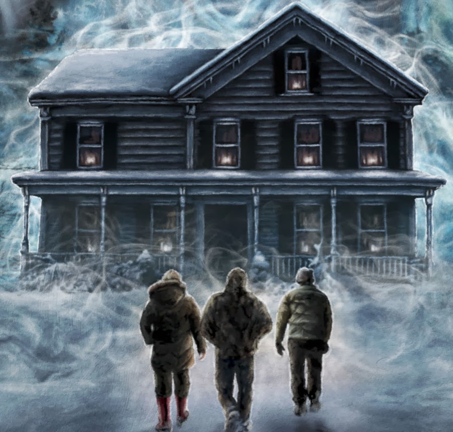
This is a film poster for a short film based on the story by Stephen King called ‘Gray Matter’, directed by Red Clark.
“taking place during the haze and howl of a deadly blizzard. A group of locals at a liquor store brave the storm to check on Richie (Larry Fessenden), a regular customer who hasn’t left his house in months and – according to his terrified son – has been slowly “changing shape.” What waits for them in the house, in the dark, is beyond their wildest nightmares."
Working on Grey Matter allowed me to create a poster design combining three of my favorite things in a horror film, Stephen King (the first novel i ever read was ‘The Shining’).
Larry Fessenden (I’m a big fan of his work and whom i have had the pleasure to work with but this is the first time I’ve been able to physically put him in a design).
and finally snow! (always a great setting).
I had quite a bit of creative license on the monster, as the FX where still in development and the Larry creature incorporates lens distortion and warping to create the effect when he ‘transforms’.
I was able to artistically interpret his melting look, (which is very fitting and in the true style of those awesome horror film posters/video covers of the 80s).
So the design itself was a real fun one to create, allowing me to move away from the more classic montage style somewhat to build an atmospheric style, having a monster as the central focus The design became very much inspired by the classic creature features of the 80′s like, The Thing, The Blob and The Stuff.
The Sacrament
Here is the artwork for Ti West’s ‘The Sacrament’ Produced by Eli Roth.
This film required a slightly different approach to the design to reflect the films docu style drama as Ti said in the press release: “It’s different from what people might expect from me and something different from what people expect from Eli as well.”
Three magazine journalists (Swanberg, Bowen, and Kentucker Audley) visit a relative (Seimetz) at a religious commune, where the mysterious Father (Gene Jones) is the unchallenged leader. Like all infamous cult tales, it doesn’t end well.
So i did a few conceptual design treatments for this one, all very different in there approach and quite a few photo based treatments, in the end this was the favoured route.
For this design i wanted to convey a more serious gritty documentary vibe. to capture the tone of the film, so using a simple striking image minimal colours and powerful bold text. The grunge quality then reflects the films unnerving dark atmosphere.
When exploring an iconic image to capture the mood, i was drawn to the visual of this ‘Father’ and his dark sunglasses, as it really captured a powerful cold expressionless detachment which i was then able i to play off by depicting a dark scene (in the glasses reflection) of the suffering of the communes followers. Hopefully setting up more questions than answers in this image to allowing the viewer to be draw into this story.
Would You Rather
Here is the second and main artwork I did for Would You Rather, the first being the teaser art which you can see here.
Working with the Director David Guy Levy we decided to go down a more classical design style for this poster art, to convey the atmosphere of The Lambrick Foundation’s dinner party which these unfortunate guest are invited to attend…
I wanted to have it feel like the poster belonged in the grand old oak dining room of the films setting and present a conservative business vibe. So the colour pallet was created to reflect this classic tone as well, with the green having an almost almost aged leather quality complimented with a slightly faded red. This ‘classical’ tone is then further drawn out in the typography of title design and the frame design.
In an early cut of the film some of ‘Wendy Carlos’s’ wonderful music was used as a placement holder in some scenes and i loved that quality in her work that is classical yet with a modern electrical twist to give it a darker and sinister edge (particularly in films like clockwork orange). So that feel was very much what i wanted to come across within the poster design, and it felt very fitting for the setting of this formal dinner party.
As there are quite a few guests at the dinner we felt it was probably best to just focus on the main ones to give the image a more simple concise visual. Britany Snow is the main character so all the focus is on her, the difficulty came in how to present characters at a dinner party (where one is sitting at the head of the table another a few seats down etc) in a simple portrait format without over complicating the visual, so i came up with the idea of having Jeffery Combs (Mr Lambrick) literally looming over Britany at the table.
The devil was in the subtle details in this one, so i encompassed visual references to communicate the darker side of the film. Having Britany sitting there tense with her streaming mascara and an expression of fear, the twist on the visual of the knife and ice pick tensely gripped in her hands. Combs merging out of the darkness with his hands on her shoulders and the shadows on his face forming subtle evil expression with devils horns on his forehead all convey this sense of evil terror and suspense.
I then was able to play about with the frame design to place the sub characters of Enver Gjokaj and Sasha Grey within it to knock them back and separate them out further from the main focal point of Britney and Coombs so they would clash. however space for these characters was then limited so i could fit in much more that a portrait image but i needed to have them in some form of peril so i utilised the unusual electrical head bands which although an average viewer wont instantly know what they are, they do suggest a form of torture and dark edge.
Finally i really wanted to incorporate the little card icons from the film. which again wont be very clear to the viewer exactly what they mean, in the context of the design you just know the its not going to be good (especially with the eye and tooth!!)
For the other actors i wanted to incorporate them all in the design as some have VERY recognisable faces if not names so i decided to include them in that classic 60s/70s line up along the bottom of the poster which gave it a nice touch i thought and also blended in well with the images of Enver and Sasha at the top.
The Heat
The Heat was an exciting
design to take on as it was my first time working with Mondo and also
getting to work with The Feig! (Paul Feig Director of Bridesmaids) on
his new buddy action cop comedy ‘The Heat’, with Sandra Bullock and
Melissa McCarthy no less!
The rough brief was to create an alternative poster design that was a
throwback to 80s action movies. So naturally they thought i’d be a
perfect fit!
Galvanized by the awesome power 80s VHS cover art i set to work creating the ultimate 80s action buddy cop visual i could, drawing out the humor in an explosion of over the top action. As The Heat is set in Boston it gave me a great opportunity to play around with the classic visual iconography of the Action film poster and really celebrate the city by giving it that sun-kissed 80s ‘Miami’ esque sunset treatment (well Boston is on the shore line), I then incorporated the classic image of the San Fran bridge (which seemed to pop up in every cheesy action poster of the time) but replacing it with the Boston bridge. Finally framing the action with the archetypal fire escape buildings we all remember from numerous 70s/80s action flicks.
The big challenge on this came with trying to handle the sheer amount of characters that where to be incorporated into the design 10 in all (including the cat!). There is an art to creating a good montage poster design, getting that zen balance of composition, characters and narrative action. Which also has a strong visual style and an actual design concept to it. You don’t just want it to just create a mass pile of stuff! or even worse just a pile of floating heads… ‘You got to sass it!’ as that great philosopher Homer once said!
The main focus for the
design was of course Bullock and McCarthy, two cops blowing away crime
with both barrels and wind swept hair, with Bullock brandishing the
badge in that iconic cops pose, and of course don’t forget the big guns,
as in all action video covers i remember they really where the big
draw, the cooler looking the better! So here i made them BIG and
representative of there characters, Sandra being the straight laced FBI
agent with her automatic and Melissa the loose cannon Boston cop
wielding a magnum.
For the Title design i really wanted that stereo typical brushstroke 80s VHS style from inspired by many Medusa covers!! the tag line was just a bolt of cheesy inspiration, i was listening to lots of 80s action scores at the time of designing it.
It became quite an epic (undertaking) poster and in trying to build this sense of OTT action along side all the films character i actually ended up adding even more elements to build a story for the viewer…
gangs fighting police, exploding cars and SWAT teams. This has to be the most intricate and detailed design i have done to date (it really needs to be seen full scale up close to take all the elements), with little Easter egg touches like scene of Rojas being dropped from the top of the fire escape and adding Paul Feig in as the top SWAT team member of the left, that was dropped in at the last minute as a surprise to Paul for which he then gave one of the best compliments to date:
“Holy shit, is this awesome!!! I absolutely love it. And so honored that he made me a SWAT team member. Finally, my true calling is captured in stone.”
Subscribe to:
Posts (Atom)