10.3.11

Ti West, The Innkeepers poster 2


Here is the second poster for Ti West's The Innkeepers and this is as about as minimal as i get! Its designed more as teaser poster unless ive grinded away for days on these poster illustration i think something is wrong!! So this one was done as an extra because Ti and Larry Fessden liked the concept so much.

Its very much designed as a homage to the serious Mystery/Thriller posters of the 70's. Again still incorporating that Victorian vibe, which relates back to the hotels mysterious past...

Along the winding path of research i did into all things Victorian i came across designs for these ornate key hole protectors, they where Incredibly elaborate (as where most Victorian things) with these flowing and curling fluer (stylised decorative ornaments that resemble the fleur-de-lis = lily flower) details which i thought had this real sinister edge. So reworked the and designs slightly overemphasising them (as i wanted to keep it subtle) so they almost felt like clawing hands which would drawing you in to the darkness of the key hole if you stared at it too long and wouldn't want to see what lies in the cold empty darkness behind... MUWAHHHHH HAA HHHHHHHHAAA!

I do have to admit it was Ti Wests idea to have an empty key hole i originally had the idea of the ghost peaking through, so i guess less is more and this way it lets the imagination fill in the blanks!

The great thing about the Innkeepers posters is that creatively i was able to reference the rich history of Victorian design for my inspiration, allowing them to have some creative substance rather than just 'a grind house poster' particularly with this title where that wouldn't have suited the plot line and totally given off the wrong impression.

6.3.11

Ti West, The Innkeepers poster


This is another big break for the dude designs!

Its the new poster for ‘The Innkeepers’ film by Ti West (House of the devil) starting Sara Paxton, Pat Healy and Kelly McGills.

It came about when like Hobo I sent an email to Larry Fessenden at Glass eye pix / Scare Flix. Saying how I’ve been a fan of their films for ages (they have a brilliant
Catalogue of original off the wall horror/thriller titles) and I just did the Hobo poster
So if they needed any posters designing for up coming films… I’m your man!

Then the next thing I know I get an email from Larry wanting me to work on a poster for none other than Ti West!!! I was stoked to say the least; I’ve also been a big fan of his films the Roost, Trigger man and House of the Devil of course!

I actually got to work quite closely with Ti West on this project as the film was still in production I never actually got to see a frame! So instead Ti sent over a selection of film posters and a write up which set the tones he wanted to present in the final poster.
I like most people was expecting to do another full on horror film but Ti kept saying
That The Innkeepers isn’t a straight horror film, it could be a G/PG rated and to think more Fightners, Victorian ghost story, Charles dickens Christmas Carol and even ghost busters!!!

I sent over 10 different concepts for this one (quite a lot for me!) and this one was one of the last I did, it was also the one that had that eureka moment! There was a bit of wrangling over the choice of the final route but I managed to convince everyone that this had the IT factor. It really ticked all the boxes! and had that strong design concept to back it up and visually tie all the elements together.

I did allot of research into Victorian design styles and got drawn towards the Art Nouveau movement in the end because of all the wavy ethereal lines and curves which set the tone so well.

I then also researched into old ghost story books covers to get a more light hearted spooky vibe and found The Fontana Great Ghost Story anthology a massive inspiration. (If you can get hold of them they do they have some amazing illustrations!).

Then finally I have to take my hat off to Drew Struzan as a big inspiration, especially when you want to set that 80’s Goonies/Adventures in baby sitting montage poster vibe.

So for the final design I blended the ethereal lines of the Art Nouveau border with ghostly mist and set the composition on three plains, the mist in the foreground, the two intrepid ghost hunters walking through the spooky mist with there torch in the middle and the ghost (which wraps around and frames the whole scene) coming out in the background (for that classic ‘its behind you’ setting)

The humour element is depicted through main characters pose as Sara is the lead character it allowed me to play with the stereo types and place the guy hiding behind the girl I was also able to emphasise there spooked expressions with the torch light.

The green/blue colouring was inspired by old oxidised copper to give it that antique ghostly feel and finally the title design was inspired by the engraved type on old bar/pub signs and mirrors, I did over emphasise the spirals and curves to be more suggestive of spooky goings on and tie in with the art nouveau style for the rest of the poster. Also note the subtle pigeon and deer head!.. Which all link back to the film and are put in a suggestive teasers, all will become clear when you watch The Innkeepers!!!

24.2.11

Obsession De Palma


Also this week the artwork for Obsession got released so im posting that up as well! this was done way before the Fantastic Factory and Hobo but took a while to get published.

Obsession by Brian De Palma its a Classic you have never seen, originally penned as a Homage to Hitchcock's Vertigo, the guys at arrow requested something fitting that had a Saul Bass Flavour, now this was done before the FF collection so up to now all arrow stuff was painted and i did a couple of concepts which combined that pained style with a Saul Bass touch but this one was more out there style wise so wasn't sure they would go with it but they did!

I wanted it to have that Saul Bass Vibe so people would get that visual recognition of the Hitchcock connection but i needed to put my own stamp on it and i didn't want to just do a total pastiche of a Saul bass poster. Also i felt due to the nature of the film being a bit of an 'unkown classic' it needed more of a visual narrative to draw you in. (that's part of the problem with the whole minimal poster trend, it does tend to rely on you knowing something about the film/story line for you to get 'it' and have that visual recognition or your left thinking WTF!? a bit). So instead i looked more towards Saul Bass's technique of woodcut printing to get the vibe across, researching into woodcut illustration i found the work of Mark Rowden Really lnspiring.
So that was the technique sorted then for the layout!

The basic story of the film is 'its a man haunted by guilt following the death of his wife', so to get this across to the viewer I divided the poster up in two halves the bright past and the dark present circa 1979. So you have Cliff Robertson expression of pure desperation set in this black square looking down on him and his wife (Geneviève Bujold) dancing from the opening scene surrounded by this bright yellow, this is then all tied together with the classic spiral to represent the Hitchcock connection!

See its not just a case of slapping things about on a page to make it look nice. You really do need allot of thought and consideration behind a piece or people will see through it, that's why it always comes back to research! You need a good grounding for a design/ illustration to give it that substance and allow you to explain what you have done and why, it also helps you sell in the designs to the client.

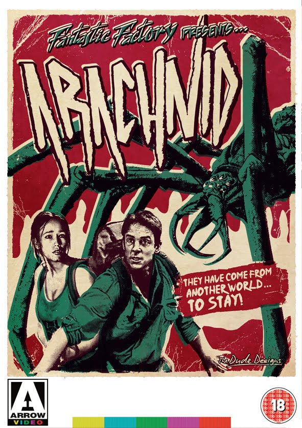
Brian Yuzna, Fantastic Factory Collection: Arcahnid, Faust Beyond Re-Animator and Romansanta


Here is the Fantastic Factory Collection,

I got given a collection of four dvds from arrow: Arachnid, Faust the love of the damned, Beyond Reanimator and Romansantana the waerewolf hunt and a short brief to 'unify the titles' and the connection was that they’re all Brian Yuzna (Director of Re Animator and Return of the living Dead 3) productions. I did a bit of research and found they fell under his production company set up in the 90s called the Fantastic Factory so hence the Fantastic Factory presents... (it was going to be the Brian Yazuna Collection at one point but it was considered a bit confusing as he directed some produced others and was a creative producer on one so not the strongest link).

So For these cover i looked at ways of making the series totally different from everything else that i have done for arrow so far. Give them a strong identity which would be able to link four VERY different titles together and would still be an adaptable style to suit each title, Most importantly though i needed to make them visually very collectable especially with the posters inside.

I did my visual research (one of THE most important parts to design!) and looked towards doing them in a limited edition screen print style. An alternative pop bubble gum twist on the classic B movie poster. Particularly with such titles like ARACHNID and FAUST they sounded like modern drive in movie titles.

So i my main aim became to create something fun and vibrant which would stand out from other dvd styles on the shelves.


17.1.11

Hobo With a Shotgun Poster


Well Its the big one and it's been all over the web now on!!:

IGN • Entertainment weekly • IMP • Worst Preview • Bloody Disgusting • Beyond Hollywood • Twitch • Shock till you drop • Screen Junkies • Greek Tyrant • Horror Society • Shock till you drop • Fangoria • Chud • Mubi

I'm proud to present the new poster for Jason Eisener's Hobo with a Shotgun, which I've been excited about since I saw the trailer in the Tarantino/Rodriguez Grindhouse film(s). Now it's a full-length feature and staring The Hauer no less - it's a proper hark back to the vigilante films of the 70's/80's and the whole future gang/ punk films of the 80's.

So it was an opportunity not to miss!!! I posted a message on the Hobo site saying "I do posters etc, love to knock something together for you guys..." and the next thing i know Jason Eisener emails me back saying:

"I'm extremely impressed by your work. We seem to share the same artistic inspirations... Would love to see what you could do with Hobo With a Shotgun.... P.s Your Jaguar Lives is inspiring. Also did you make that vigilante video logo? Its amazing. "

Well I was stoked to say the least and worked my ass off to turn something around quickly before they forgot i ever emailed them!

There was no holding back on this baby - I went for the full balls out 70s/80s exploitation vibe, throwing everything into the pot and looking back over every exploitation poster I did for inspiration!

My main thought process/direction for the poster was to give it a strong narrative. I mean, that's what was so great and captivating about the old posters, they really drew you in visually, telling you what the film was about. It was easy with this film - all i had to do was say "Look at this cool thing here... and also over here... and check out Hauer, he's in it and he has a MASSIVE shotgun and he looks PISSED!!!"

I did take liberties with the shotgun, making it look more over-the-top/futuristic, which is all part of the style! It's just the done thing - check out the covers of Savage streets and the executioner part 2. Another must is that you always need a helicopter. Whether there is one in the film or not there's a definite correlation between the decline in the number of painted helicopters and the quality of movie posters these days! A helicopter tells you it's exciting, and there's a budget!!!
(Well, a helicopter in a poster used to tell you that but I'm getting old these days. Maybe kids today just aren't impressed by such a thing. When I was growing up we based an entire tv series JUST on a helicopter!!!)

As far as the colouring goes, everything I saw already for Hobo had a strong yellow and black colouring but I didn't want people to think of Kill Bill, as a friend pointed out, so I needed to bring in some colouring which would give the poster its own feel. So after looking at the trailer again and again and again...I wanted to reflect that vibrant, neon, almost-80's style, so i brought in a strong use of magenta/purple in the sky and on the lighting for Hauer.

The massive Hauer title at the top is, again, harking back to the glory days of the old Charles Bronson films, where the lead actor's name was usually bigger than the film title. I've got a great video of The Evil That Men Do on which most of the cover is taken up with 'BRONSON' printed across it three times! I didn't want to go that far but i felt RUTGER HAUER, quite bold, gave it some attitude and come on... it's RUTGER HAUER! This is the dude that kicked Gene Simmons's ass!!! And Harrison Ford's (that one's for making Indy 4!)!!! Then I played around with 'is'/ 'in' to link the actor and the movie title, but none of them seemed to fit. So i thought it would be funny to say RUTGER HAUER is a... Hobo With a Shotgun! And it stuck.

This really was a dream project, although it was also a whole lot of work! I'll fondly remember losing the will to live, sat in a seedy internet shop for 2 hrs while the slow-ass connection tried to send a 500mb file on New Year's Eve! ...but all for a good cause, great to work on from start to finish and the guys Jason Eisener (Director) and Rob Cotterill (Producer) were amazing and incredibly receptive to everything! Plus most of all it's going to be an AWESOME movie, the guys just get it! From the story, to the visual style, to the music!

SO GO CHECK IT OUT!!!

Trailer
• Hobo Web site