Showing posts with label video cover. Show all posts

14.12.11

Modus Operandi DVD artwork


Here's the artwork for the DVD release of Frankie Latina's 2009 film Modus Operandi, which stars Danny Trejo, Mark Borchardt, Michael Sottile and Randy Russell. Frankie wrote, shot, and directed Modus over the course of four years, all shot on Super 8 film. It's a homage to B-Movies of the 60's and 70's. So i guess that's why they came to me!

So this was always going to be a fun cheesy design to play around with!

Colourful, packed with action, sex, gals, boobs and guns! Planes, helicopters... and even a phallic boat this time!


The guys wanted to promote Danny Trejo (being the most well known actor of course!) but while he's kind of a sub-character who's integral to the story, his appearance in the film isn't long enough to sell the film purely on the strength of. So i had to make him central to the montage but not the most prominent element, hence the other characters being larger!

Randy Russell (guy at the bottom) is the main protagonist and he's not your typical looking lead character, so i did pimp him out a bit more for added attitude with the shades and suit look. I also couldn't pass up the opportunity (with the film reel element of the storyline - watch the DVD, it will all make sense!) to play up a total and shameless homage to one of my own favourite film posters for the 1976 film Hollywood Man with William Smith!! Coincidentally I think Hollywood Man has just been released on DVD again in the US.

The other two main characters are Dallas Deacon (on the left) and the sexy Black Licorice... who i again pimped out in a low cut gold lame jump suit! Gotta love the jump suit!! I also threw in a bit of sexual innuendo with the aforementioned speed boat powering out from between roller girl's legs!


Colour-wise i went for a strong 70s yellow, brown and orange pallette, taking lead from the very cool interior decor styling seen throughout the movie (a set Frankie the director actually built himself... the man can decorate my flat any day!!!). I wanted to capture the same classic retro decor tone with the style of the packaging design. The use of the old Super 8 logo sticker was actually from the director who i got chatting with while working on the cover and i think it really builds on that whole vintage packaging vibe!

16.11.11

German Super movie DVD Blu-ray cover


This is the German DVD Blu-ray artwork i created for Kotch Medias release of James Gunn's Super movie. they sound like a company who know what they like and it wasn't the truly terrible UK artwork. Time was tight on this one and i was working on another job when this came in so i worked up a rough photo concept which now seems to seep out on-line but this is the actual artwork!

The original artwork had a strong creative and took a more high concept route. which i guess didn't really work more for the DVD market the UK released THIS! (shudder). So i got contacted by Kotch Media to produce a design which would be more cast orientated! as there really is a plethora of talent going on in this one (Rainn Wilson, Ellen Page, Liv Tyler, Kevin Bacon and the great Michael Rooker!!) so i wanted to get everyone in the action but still give the artwork some style which related back to the films storyline. I explored two routes for this design one being the classic 70's esque over the top explosion and big title treatment, then this one which Took the super hero theme which treated the whole DVD cover 
a classic comic book design, the composition still has that narrative poster style but building it around the comic book concept allows the visual to capture the vibe of the films story line and then relate it back to the viewer, it also gives the cover a different twist and a more fun look to stand out on the shelves against the other movies.


I saturated the use of colour more in the illustration to give the thing that comic illustration vibe without being too 'cartoony' and polished it off with that old dot printing effect and offsetting the colour plates slightly so the whole piece has that distorted out of registration look (you can see a more detail section above). Again i was very happy that Kotch media ran with this as well and didn't just request a more clean version of the artwork to be used.

2.11.11

Download and make your very own FREE Hobo Video artwork


I promised if the Dude Designs FB group counter got to 500 i would post up the Hobo video cover artwork i created for the evening with the dude designs video to allow people to download it at home and print off to make your very own FREE! Dude Designs Hobo video cover like this.


To say thanks for all the on going support with these posters and to give a little something back!
It's not easy but seeing people enjoying this stuff and hopefully bring some magic back into the world of poster designs makes it all worth it!

So enjoy !!!

25.3.11

Savage Streets Linda Blair


Savage streets was a cool one to work on as i got to give it that real 80's video cover style mixed with the classic action poster montage structure and inject a little something different to the other versions that have been done, the composition was the main challenge with this one as there had already been about 6 totally different posters, video covers and DVD covers already designed for it in the past, and they where all great (even if someone felt Adrienne Barbeau was hotter looking that Linda Blair on the classic uk Medusa release).

Watching the film there was one (or two) BIG things that jumped out at me! I have never seen such an indulgent use of breast in a film since an episode of Benny Hill! from Linda Blair bouncing down the street in the intro, to the gym class work out, to the shower fight scene.... i could go on! (im never going to be able to watch the exorcist the same again!!!). So wanted it to have an 80's action film meets tacky 80's porn vibe. Which i reflected in the colour scheme, Linda 'glamour' baby doll pout porn hair pose... I admit it may be a bit heavy on the sex but i felt that this was a big part of the film and an avenue for the design which hadn't really been explored so blatantly before in the other poster/cover treatments, so it was a different approach which would allow me to bring something alternative to cover.

I also really enjoyed playing about with the type giving it a new title treatment and getting that quintessential VHS style to it... ahh a rough script with a flat colour drop shadow... nothing says video box art better!!!

Well hope you like this take on a classic video title.

Pervert!


PERVERT! Well this was a bit of an oddity Its one crazy ass movie, created as a homage to Russ Meyer movies of the 60s.

Which really needed to be drawn out in the tone of the cover as the danger was people could get turned off by thinking its was just some crappy soft core porno film which are A) awful and B) a dime a dozen.

So this design is a total love letter (or soiled sock!... bad joke!) to the sexploitation film posters of the 60's and 70's.

unlike allot of the action / horror style posters theses usually had a more minimal layouts focusing on the one girl with the big curves to pull in the punters to the seedy cinema joints, i did have to tone the curves down a bit though after the first draft so i hope ive still managed to maintain the impression of Mary Cary having some shape in this film and not just looking stick thin).
where these posters really went for it though was with the use of type, something which doesn't get used much in the Arrow illustrations so i think ive made up for it with Pervert!!
Russ Meyer's was a total show man (i read some where that he used to make the posters first then if they where well received then he would make the film) and there was a definite carnival approach to selling these films, with outlandish statements made on them, so i took a couple of quotes form the us poster and DVD, but i have to admit im responsible for the cumming to get you and Busting out in... all bad puns i know!

I found allot of inspiration from posters like 'A trip with teacher' and 'Stepmother' where i loved the juxtaposing of illustration styles the main character is quite polished and then having rough sketchy line drawings for the background characters, its something i hadn't done before and i think works really well.

For the film title it was a bit of a twist on the classic cookie font which just says 70s and sexy so well, the phallic exclamation mark is actually not just a childish joke but like the innkeepers title has a bit more meaning behind it and the strange storyline...

24.2.11

Obsession De Palma


Also this week the artwork for Obsession got released so im posting that up as well! this was done way before the Fantastic Factory and Hobo but took a while to get published.

Obsession by Brian De Palma its a Classic you have never seen, originally penned as a Homage to Hitchcock's Vertigo, the guys at arrow requested something fitting that had a Saul Bass Flavour, now this was done before the FF collection so up to now all arrow stuff was painted and i did a couple of concepts which combined that pained style with a Saul Bass touch but this one was more out there style wise so wasn't sure they would go with it but they did!

I wanted it to have that Saul Bass Vibe so people would get that visual recognition of the Hitchcock connection but i needed to put my own stamp on it and i didn't want to just do a total pastiche of a Saul bass poster. Also i felt due to the nature of the film being a bit of an 'unkown classic' it needed more of a visual narrative to draw you in. (that's part of the problem with the whole minimal poster trend, it does tend to rely on you knowing something about the film/story line for you to get 'it' and have that visual recognition or your left thinking WTF!? a bit). So instead i looked more towards Saul Bass's technique of woodcut printing to get the vibe across, researching into woodcut illustration i found the work of Mark Rowden Really lnspiring.
So that was the technique sorted then for the layout!

The basic story of the film is 'its a man haunted by guilt following the death of his wife', so to get this across to the viewer I divided the poster up in two halves the bright past and the dark present circa 1979. So you have Cliff Robertson expression of pure desperation set in this black square looking down on him and his wife (GeneviĆØve Bujold) dancing from the opening scene surrounded by this bright yellow, this is then all tied together with the classic spiral to represent the Hitchcock connection!

See its not just a case of slapping things about on a page to make it look nice. You really do need allot of thought and consideration behind a piece or people will see through it, that's why it always comes back to research! You need a good grounding for a design/ illustration to give it that substance and allow you to explain what you have done and why, it also helps you sell in the designs to the client.

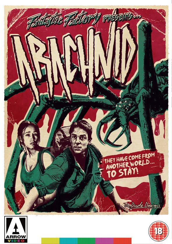
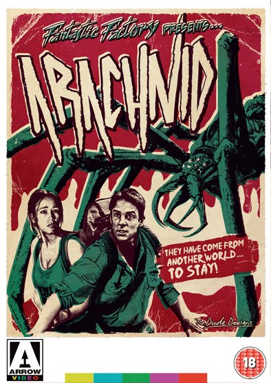
Brian Yuzna, Fantastic Factory Collection: Arcahnid, Faust Beyond Re-Animator and Romansanta


Here is the Fantastic Factory Collection,

I got given a collection of four dvds from arrow: Arachnid, Faust the love of the damned, Beyond Reanimator and Romansantana the waerewolf hunt and a short brief to 'unify the titles' and the connection was that they’re all Brian Yuzna (Director of Re Animator and Return of the living Dead 3) productions. I did a bit of research and found they fell under his production company set up in the 90s called the Fantastic Factory so hence the Fantastic Factory presents... (it was going to be the Brian Yazuna Collection at one point but it was considered a bit confusing as he directed some produced others and was a creative producer on one so not the strongest link).

So For these cover i looked at ways of making the series totally different from everything else that i have done for arrow so far. Give them a strong identity which would be able to link four VERY different titles together and would still be an adaptable style to suit each title, Most importantly though i needed to make them visually very collectable especially with the posters inside.

I did my visual research (one of THE most important parts to design!) and looked towards doing them in a limited edition screen print style. An alternative pop bubble gum twist on the classic B movie poster. Particularly with such titles like ARACHNID and FAUST they sounded like modern drive in movie titles.

So i my main aim became to create something fun and vibrant which would stand out from other dvd styles on the shelves.


29.12.10

Vamp Arrow Video DVD cover illustration


Here is the new illustration for the 80s classic Vamp!

When i was given the job the first thing they requested was that i incorporated a 'special' colour into the illustration. So colour became the big theme for this cover, it's also a representation of the films style too. when i watched it again i really picked up on the strong use of 'comic book' style lighting and neon colours used throughout.

It also really needed it to shout '80s' to people and i drew the title in a classic brush script (cornering the V and P into fangs, although this did get lost a bit lost behind the characters in the end), i then toyed with the idea of dropping in a green neon grid for the background but felt it didn't say anything about the film and instead i opted for some neon esque pyramid styling (a nod to the Vamps origins!) with stars and a full moon to set that 80's retro mood.

Finally i wanted to visually represent a more comical side of Vamp to let people know sort of film there getting themselves into. I felt going down a dark gory horror route wouldn't be appropriate for this title and would just alienate a load of potential viewers (its a extremely tame horror film by todays standards) so i was trying to sell it more on its strength of 80s teen horror nostalgia, appealing to any retro hipsters out there! or people just looking for a good ol' classic light harted horror romp! ... just like you remember them (before torture porn destroyed all that!).

For the layout i used Grace Jones for the main character to represent the horror aspect by having her literally lunging out of the cover to grab you! then i framed her with the other characters to show the more non serious elements with funny/repulsed expressions.


28.9.10

Deadly Outlaw Rekka Takashi Miike DVD cover illustration


Hi, Ive been sitting on this one for about a month now waiting to post it, its the new illustration for Arrow Videos Deadly Outlaw Rekka directed by Takashi Miike.

DOR is more adult (and violent) film than Jaguar Lives, so it needed a darker vibe plus its also a more modern title (2002) so i couldn't have the same cheesy layout as JL obviously. But i still wanted to keep that classic looking VHS artwork style.So the first thing i did was to create the film title. I new i wanted the cover dark this time but with a vibrant title, so i immediately thought back to films like The Warriors, Repro man, Maniac with there splattered spray paint esque logos, which look great against a plain black background. Plus this film is all about bloody revenge so it was a bit of a no brainier what needed doing.

For the illustration itself i have always loved those dark to white style paintings so this would be a great opportunity to play about with that, having all the characters coming out and merging with the darkness would really set the right tone. As the painting was quite dark though i needed to give it that extra kick (so i wouldn't get lost on the shelf), so offset the black with big bold bloody red strokes and splatter it allowed me highlight the characters and incorporate the logo style into the illustration more.

There were not many assets to work with for this one. Particularly of the main character Riki Takeuchi, (he is one crazy mother! Just google him) but he has an awesome expressive face so i based him on a mixture of elements and the same goes for Yƻya Uchida (the old dude) he has an amazing white main of hair, i had to drop him in on the cover (even though he doesn't last long on the film, he's quite central to the story and very iconic) his hair actually proved to be one of the most awkward bits to do. The only real image i had from the film was of the severed hand strangle (a brilliant scene!) but it was very dark (literally) with not much detail, so quite a bit of work went on for that one too.

All in all I'm really happy with how its come out, love the bright red contrasting with the black (i did use a similar effect on the Cronos which i did after rekka... but i just couldn't help myself!!). Well Hope everyone else likes it too.

9.8.10

Jaguar lives Joe Lewis, Donald Plesance, Christopher Lee Arrow video DVD Cover illustration


A recent commision i recived from Arrow Video to create a cover illustration for the lost classic Jaruar Lives Staring Joe Lewis, Christopher lee and Donald Plesance among many others.

They wanted a classic vintage illustration style montage for the cover quite 'Colourful' and 'bright' so i had to tone down the aging and weathering on this one without loosing my over all style to it, so I went with a yellow hue for the colour palette which allowed me to give the illustration that punch vibrancy on shelf, yet still conveying that classic 70's/80's martial arts pulp poster dude designs vibe.
Hope you like, ill look forward to seeing it in store. The film looks killer too check out the trailer here: JAGUAR LIVES! and you can buy it here: ARROW VIDEO


The cover been also getting some great feed back on the Cult Lab forum for Arrow Video here . Which is great especially as people seem to be liking (and getting) the idea around the whole Retro Video illustration style... Death to nasty photoshop montages!! and thanks to every one for the kudos on the forums.